Dining + Design: A Conversation with Blue Hill about Narrative and Managing Expectations
Mitchell Davis
Mitchell DavisApril 26, 2013

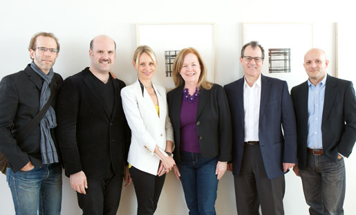
Dan Barber, Mitchell Davis, Laureen Barber, Susan Ungaro, Peter Guzy, and Fabio Parasecoli (Photo by Clay Williams)
JBF Award winning chef Dan Barber, his sister-in-law and Blue Hill creative director, Laureen Barber, and JBF Award–nominated architect Peter Guzy gathered at the New School on April 22 for a conversation about the relationship between dining and design. Moderated by myself, the conversation was the first installment of Dining + Design, a joint series between the James Beard Foundation and the New School. (You can watch the panel on the New School's food site, Inquisitive Eater.) Guzy, who designed both the diminutive original Blue Hill on Washington Place in Manhattan and the stately Blue Hill at Stone Barns in Westchester County's Pocantico Hills, explained how the successful architecture of a restaurant is an extension of the narrative of the cuisine.
Citing an essay in Eating Architecture by professor Marco Frascari, I opened the conversation with the provocation: “Architecture and gastronomy employ similar procedures of production. The process by which a hut built to house a holy image is refined into a temple, or a covered market is transformed into a basilica, is the same as that by which a boiled neck of mutton is refined into côtelettes à l’impérial or a grilled fowl made into poulet à la Marengo.” Guzy concurred, noting that the process of designing Blue Hill began when Dan cooked him dinner in a dark, low-ceilinged, dirty, “shoe box” of a space that would become Blue Hill.

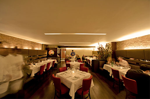
Blue Hill in New York City
“It was even a normal shoe box, it was a flip-flop shoe box, the ceilings were so low, 7 feet 11 inches,” Guzy remembered. Dan had fallen in love with the space for reasons that Guzy didn’t immediately understand. Laureen, who introduced Guzy to Dan, believed in her brother-in-law’s vision, but described the space as “dirty.”
“I knew I liked Peter,” Dan recalled, “when he looked at this space with low ceilings and suggested we lower them.”
"That was a classic Frank Lloyd Wright trick of managing expectations," Guzy admitted, "Lowering a portion of the ceiling at the entrance to suggest the rest of the ceiling was higher than it actually was. "
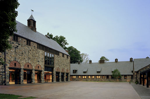
The theme of managing expectations was a common thread in the conversation and in the narrative of the design of both restaurants. Part of what Dan liked about the original Blue Hill space was that it’s small scale would allow for him to overdeliver on the food at a time, 1998, when chefs were building cathedral restaurants, monuments to their cuisine. Dan imagined something simpler, more intimate, though he admitted he had no idea what he was going to do. In contrast, the expectations on Blue Hill at Stone Barns were tremendous, he said, and he’s still not comfortable with them.

Blue Hill at Stone Barns
Bridging the experience between the architecture of the space and the cuisine in the kitchen, Laureen’s deisgn and décor helped match the expectations of the guest, too. Dan explained how the price point of Blue Hill at Stone Barns required some help to meet the simplicity and minimalism of his cooking. Referring to an image of a piece of bread with a quenelle of Swiss chard marmalade on a beautiful plate, Dan explained how in order to charge for that bread it needed to be presented in a certain way. Even though he was working with a wheat geneticist to develop a unique strain of wheat suited to growing in Westchester with maximum flavor, it was still a piece of bread on a plate. Laureen worked for a year with a local potter to create a plate for the bread imprinted with sheaths of wheat. They tried four different varieties of wheat to create the effect they wanted.
Interestingly, there was evidence during the talk that Dan’s design taste alone might not have produced the incredible success of the Blue Hill enterprise without the team that made him look so good. For example, it came out that he liked some of the old Americana elements of the original Blue Hill space, which had been a speakeasy during Prohibition. Laureen and Guzy dismissed them as kitsch. Looking a photograph of the Blue Hill at Stone Barns dining room, Barber realized he had fought against almost every design element in the picture, from the demolition of the ceiling to reveal the barn-height structure of the building, to the large mural of a wilderness scene that anchors the space.
The panel confirmed the effort and attention to detail that goes into both the design and the food of a great restaurant, as well as the synergy produced when a team of creative, smart, and caring people work together, is a recipe for success.
--
The 2013 James Beard Foundation’s Restaurant Design Awards will be presented at Avery Fisher Hall on Monday, May 6. The ceremony and gala reception is open to the public. Attend, watch live, or follow on Twitter.
See the schedule and details of upcoming Dining + Design talks.
For additional reading on the relationship of food and design, see the New School’s Fabio Parasecoli’s Huffington Post post page.


